
Overview
Custom Reports (also called the data catalog, analytics catalog, or reporting catalog) is built on two catalogs, and they are the starting point for everything you do here. The Analytics Catalog is the raw material: the metrics, facts, and attributes you combine to make a chart. The Visualizations catalog is your team’s shared library of saved charts, KPIs, and tables, ready to drop onto a dashboard. Knowing which catalog holds what, and how to search each one, is the fastest way to go from a question to a finished dashboard tile.Before You Start
You need access to Custom Reports before the catalogs appear. You can open and use the catalogs if you are an Admin, Partner Admin, or Support user, or if a Partner Admin or Support user has assigned you a Reporting Access role of “analytic” or “viewer”. The role is set from the “Reporting Access” dropdown in the User Info section of Manage Users. The “analytic” role lets you build and save dashboards and visualizations and see shared dashboards. The “viewer” role lets you see only the dashboards that have been explicitly shared with you. A user with no Reporting Access role assigned cannot open the catalogs. Building and saving new visualizations requires your company to be on the Custom reporting tier; on the Free tier, reporting is read-only. The Analytics Catalog lives in the left panel of the Report Designer; the Visualizations catalog appears in the left panel of the Dashboard editor and in the Designer’s Open dialog.Steps
Open the Analytics Catalog in the Report Designer
Open the Report Designer. The Analytics Catalog lives in the left panel. Every chart and KPI in Reports is built from items in this catalog: you drag them into the bucket drop zones in the Configuration panel, and the canvas renders the result.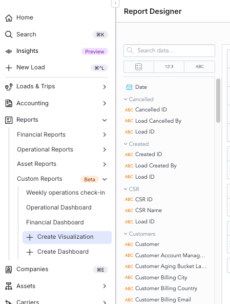
Recognize the three kinds of catalog items
The Analytics Catalog has three kinds of items: metrics, facts, and attributes.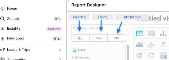
Search the Analytics Catalog for what you need
Type a business word in the search box at the top of the Analytics Catalog panel, for example Revenue, Customer, Lane, On-Time, or Margin. The panel filters as you type. When two items share a similar name, for example Revenue and Total Revenue, prefer the simpler one and let dashboard filters do the slicing.Open the Visualizations catalog
The Visualizations catalog is your team’s shared library of finished charts: KPIs, trends, tables, and breakdowns that someone has already built and saved. It is separate from the Analytics Catalog: instead of raw building blocks, it contains complete visualizations you drop straight onto a dashboard. You will meet it in two places: the left panel of the Dashboard editor (when assembling a dashboard, search here and drag finished tiles onto the grid), and the Designer’s Open dialog (when you want to load and tweak an existing visualization).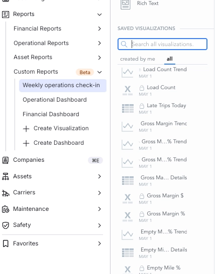
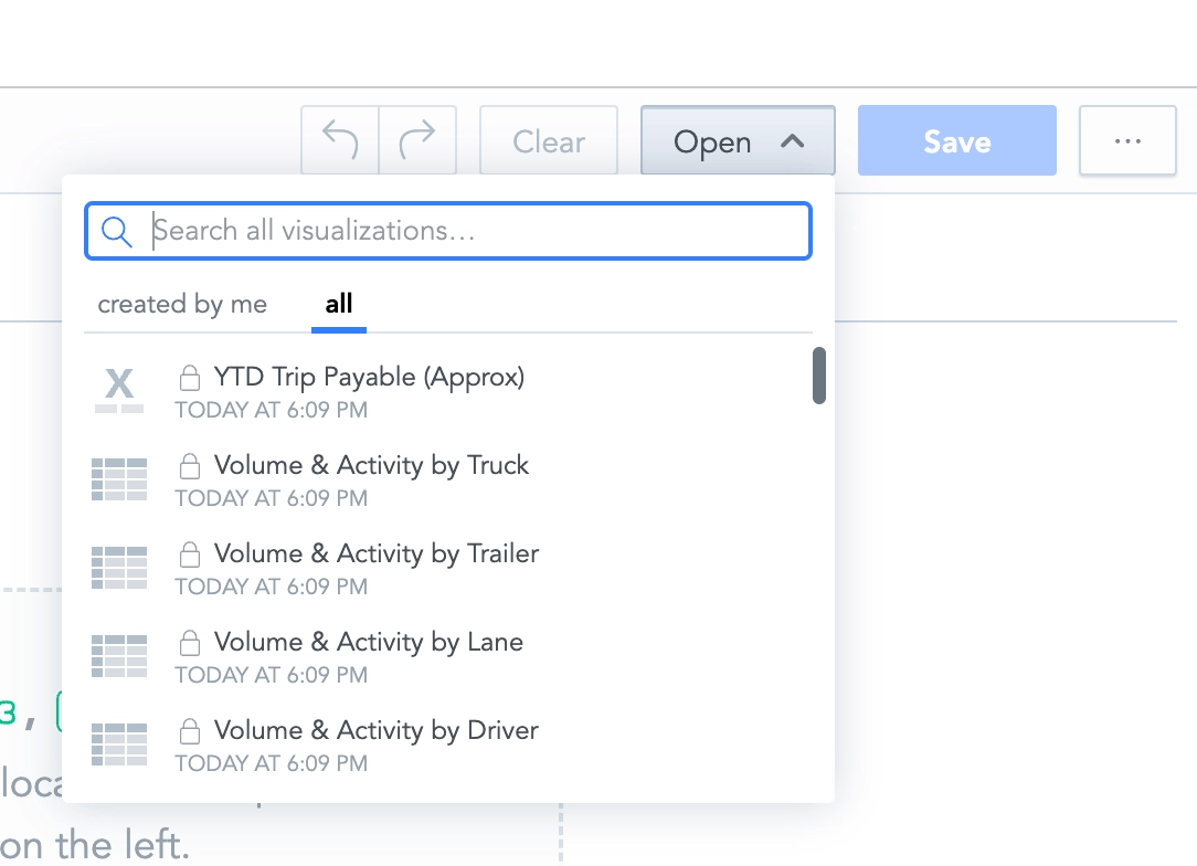
Search the Visualizations catalog for what you need
Type a business word in the search box. Search for what you are trying to show, not the underlying data field name: “Revenue” finds revenue tiles and trends; “On-Time” finds OTD and OTP variants; “Customer” finds customer breakdowns; “Margin” finds margin heat maps and trends; “Top” finds the Top-N tables and bar charts.Result
You can now move confidently between the two catalogs. You know that the Analytics Catalog holds the raw building blocks (metrics, facts, and attributes) you combine in the Report Designer, and that the Visualizations catalog holds the finished charts you drag straight onto a dashboard. You can search each catalog by business word and pick the right item for the question you want to answer.Variations
- Building a brand-new tile: work in the Analytics Catalog inside the Report Designer.
- Reusing something your team already made: work in the Visualizations catalog, from the Dashboard editor or the Designer’s Open dialog.
- Working with dates: drop a date attribute, then use the Group by option on the bucket chip to group by Month, Quarter, or Year.
- Writing a custom metric: facts come into play only when you write MAQL formulas.
Troubleshooting
A teammate cannot see the catalogs at all
- Confirm the user has a Reporting Access role. A user with no role assigned gets no catalog access.
- Have a Partner Admin or Support user open Manage Users, find the user, and set the “Reporting Access” dropdown to “Analytic” or “Viewer”.
- Ask the user to sign out and sign back in so the new access takes effect.
Cannot save a new visualization
- Confirm your company is on the Custom reporting tier. On the Free tier, reporting is read-only and saving new visualizations is blocked.
- Confirm your Reporting Access role is “Analytic”. The “Viewer” role can see shared dashboards but cannot author or save.
A search returns nothing
- Search by a business word rather than an internal field name, for example “Revenue”, “On-Time”, or “Margin”.
- Confirm you are searching the right catalog. The Analytics Catalog holds metrics, facts, and attributes; the Visualizations catalog holds finished charts.